aam
A VR experience that puts the harvest back in your hands. Designed for the city person with no tree.
Not about the fruit. About the feeling of waiting for it.
For many who grew up near a fruit tree, mango season was a daily routine: check the tree, note the colour, decide it needs one more day. Anticipation building slowly until plucking felt earned. For most urban Indians, that relationship is gone. The mango arrives pre-sorted in a supermarket net bag. The ritual is not part of the transaction.
Aam asks whether VR can reconstruct the feeling of tending toward a tree, not just the visual presence of one. The goal is not to simulate eating a mango. It is to simulate having a tree to return to.
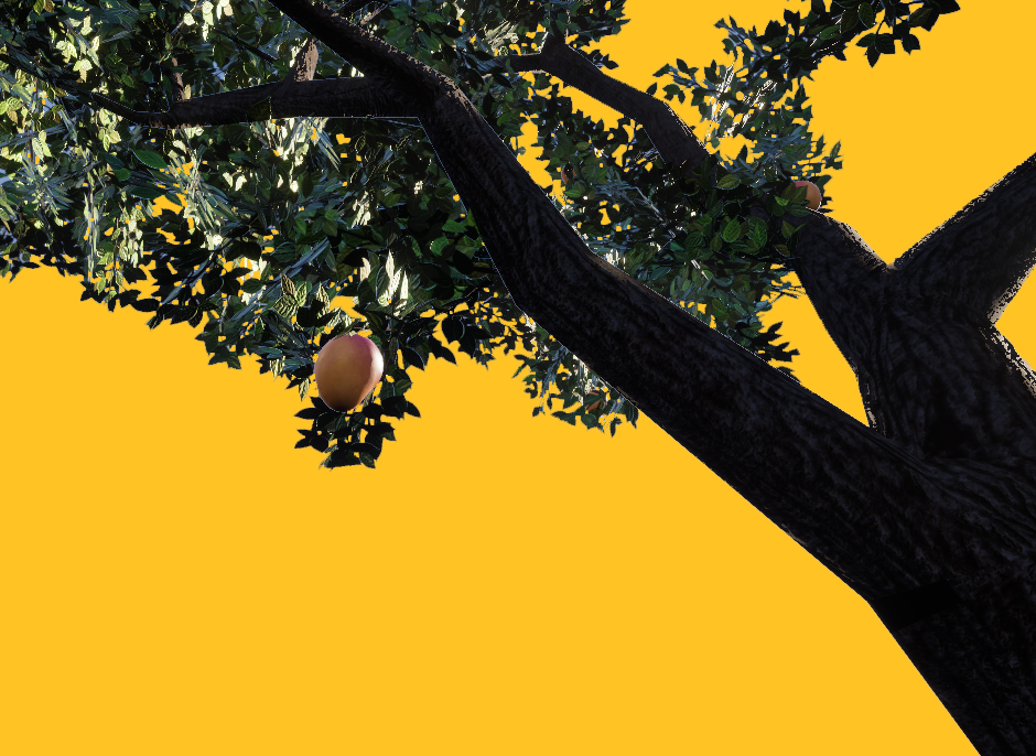
Mango. The most culturally embedded fruit in the Indian subcontinent, referenced in the Vedas and in Mughal court poetry alike.
Ordinary. Common. As in aam aadmi, the common person. This experience is built for the city person with no garden.
Three principles. Used as constraints, not decoration.
These three principles from Japanese aesthetics were applied as hard constraints on every environment and interaction decision. The logic is the same as Zen gardens and bonsai: the act of tending is the practice, not a means to an end.
Every element earns its presence. If it does not serve the user's task, it does not exist in the scene.
The environment should feel unhurried and organically placed. No game-UI chrome bleeding into the world.
Empty space is not a failure to fill. It is the reason the tree reads as the focal point.
Research backing ↓
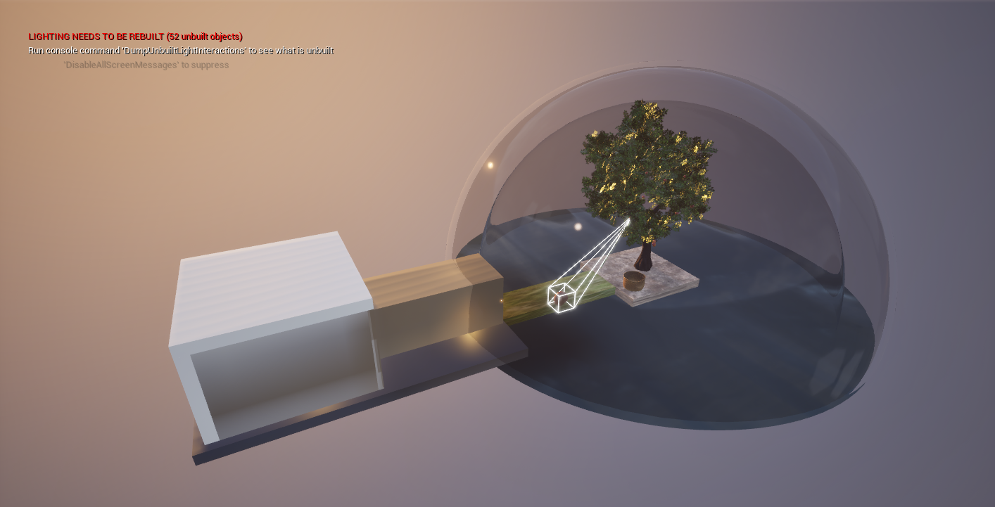
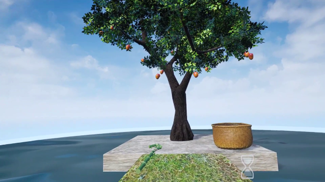
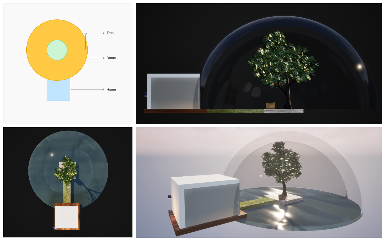
Environment design in Unreal Engine 5
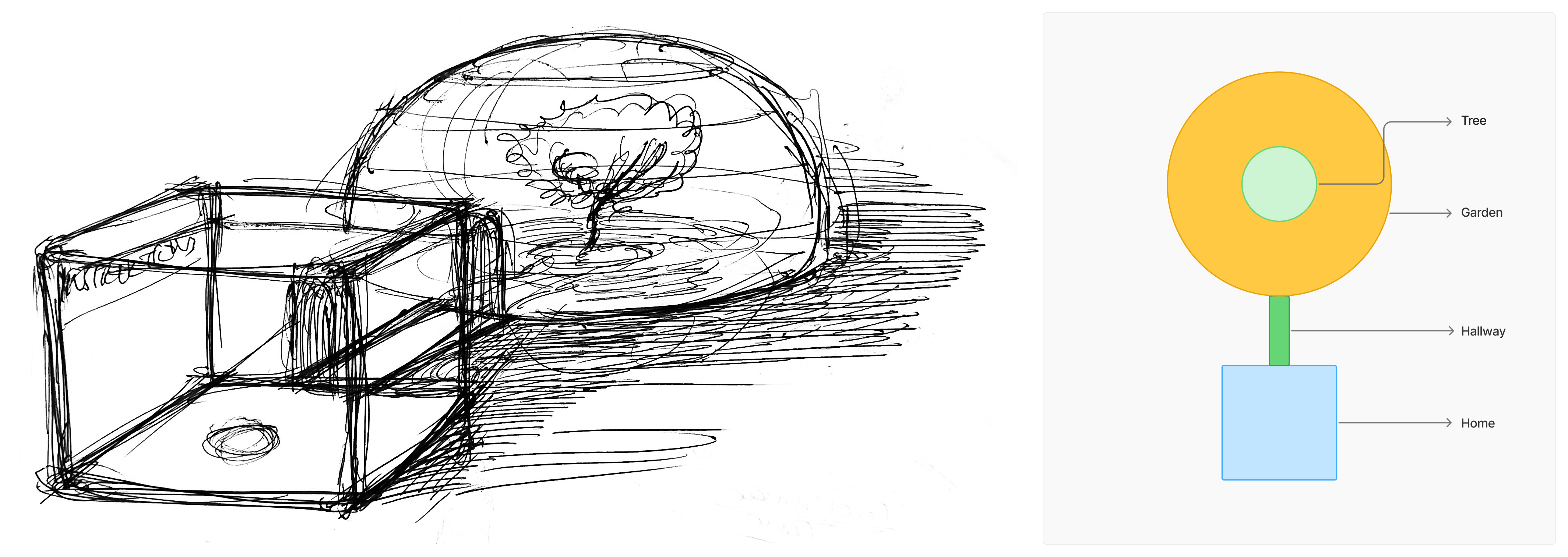
Sketches & early concepts
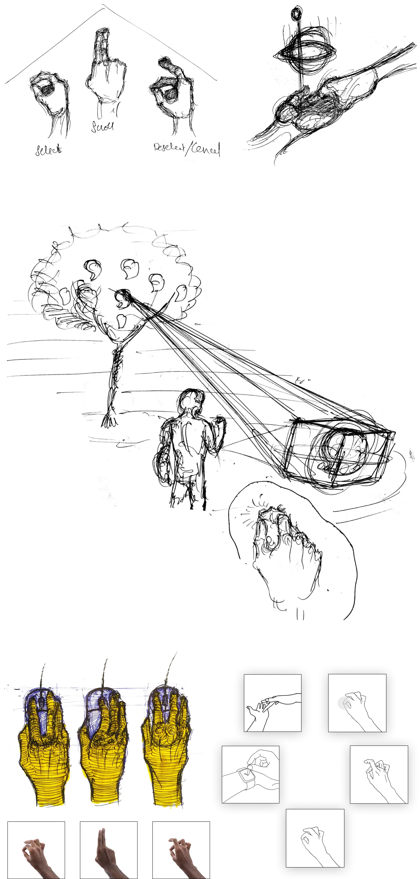
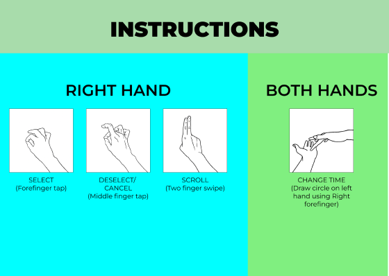
No controllers. Gestures that feel like memory.
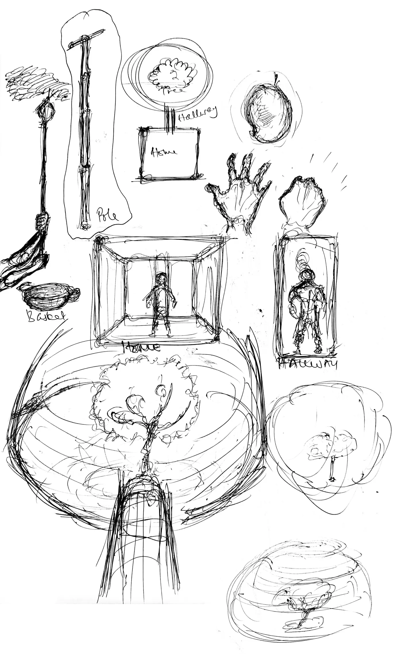
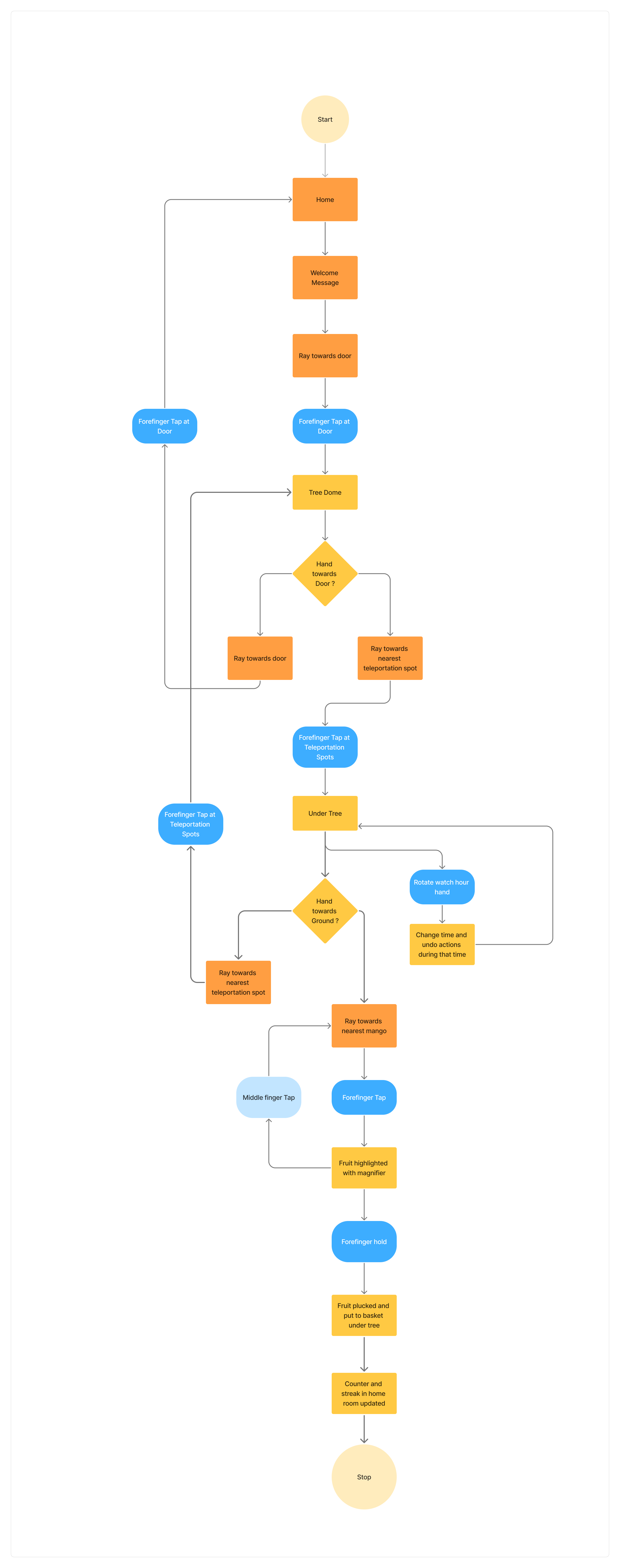
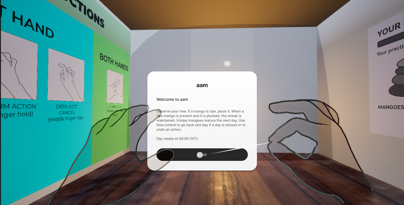
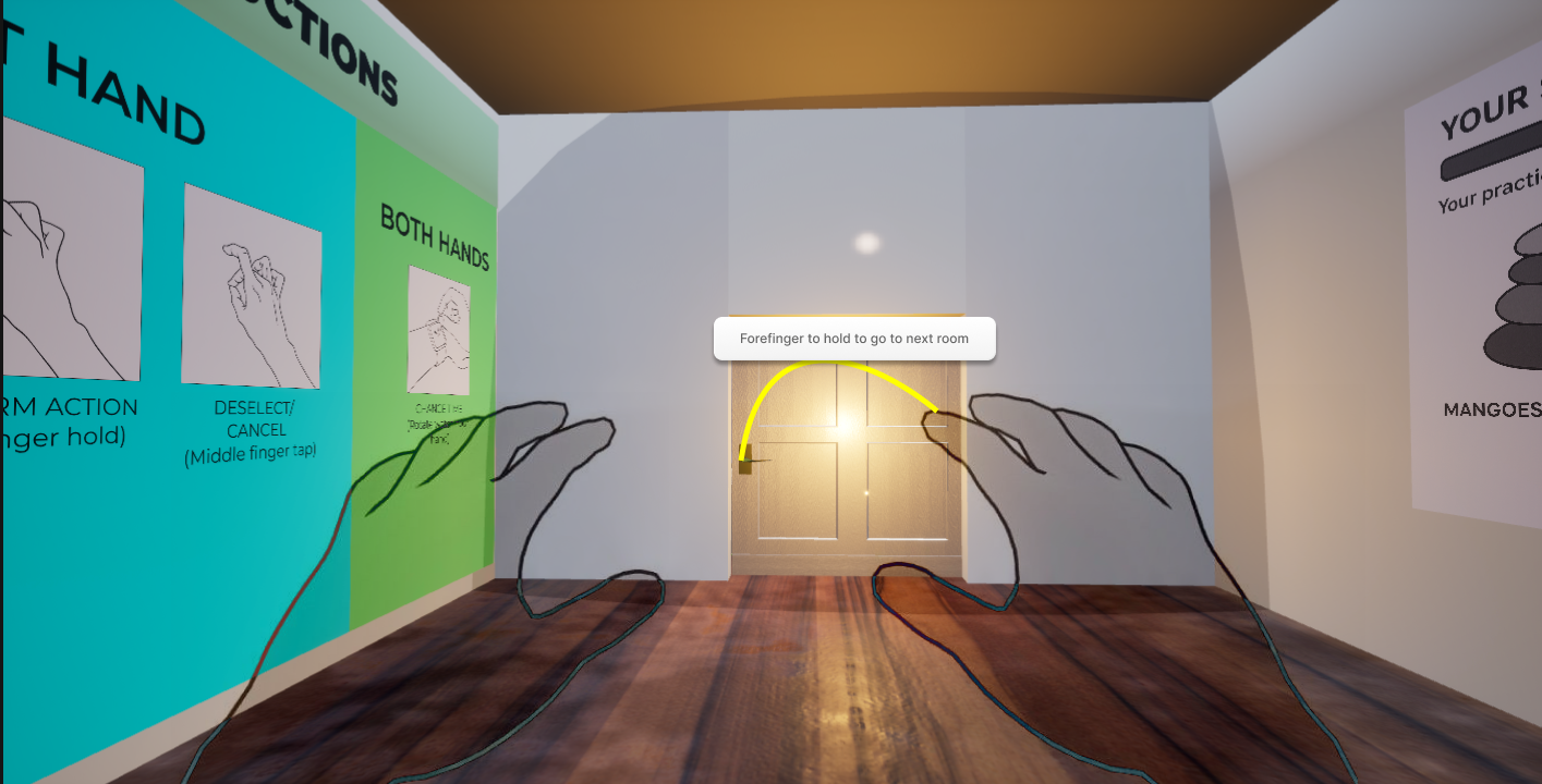
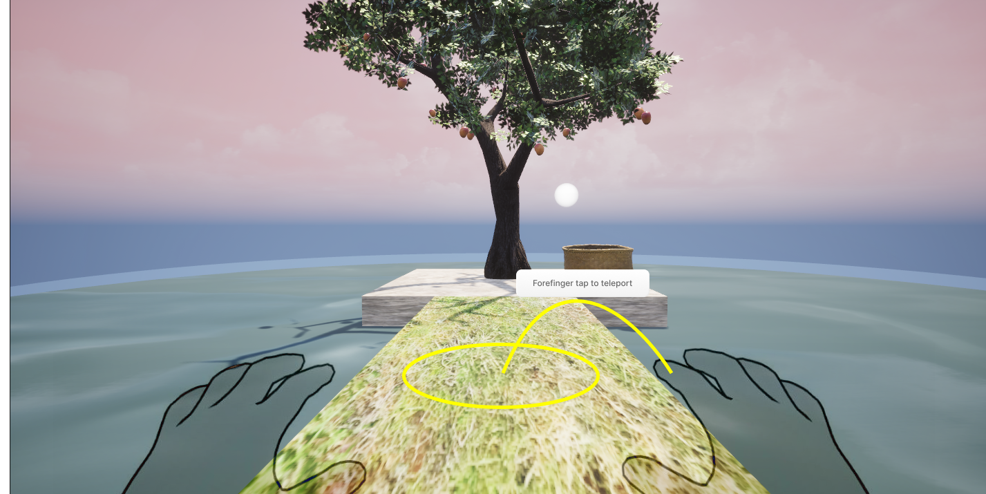
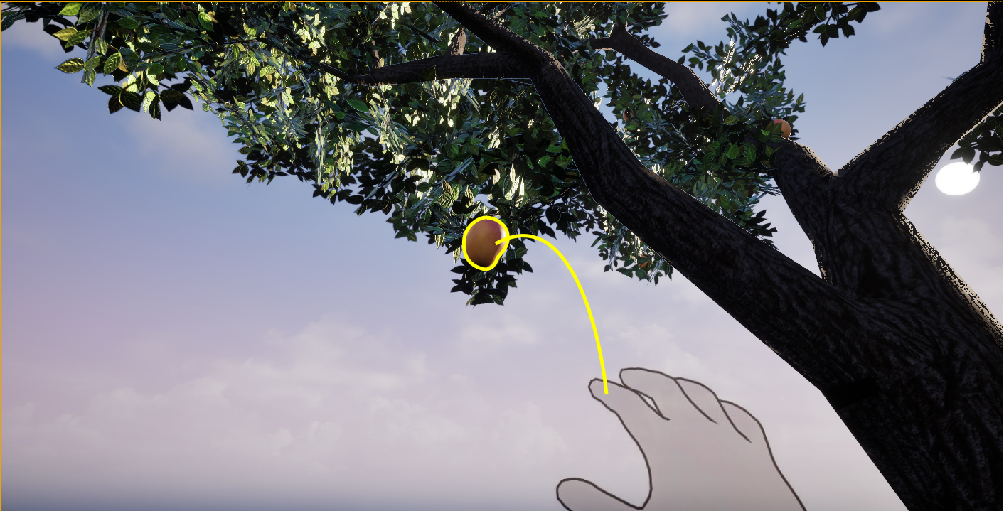
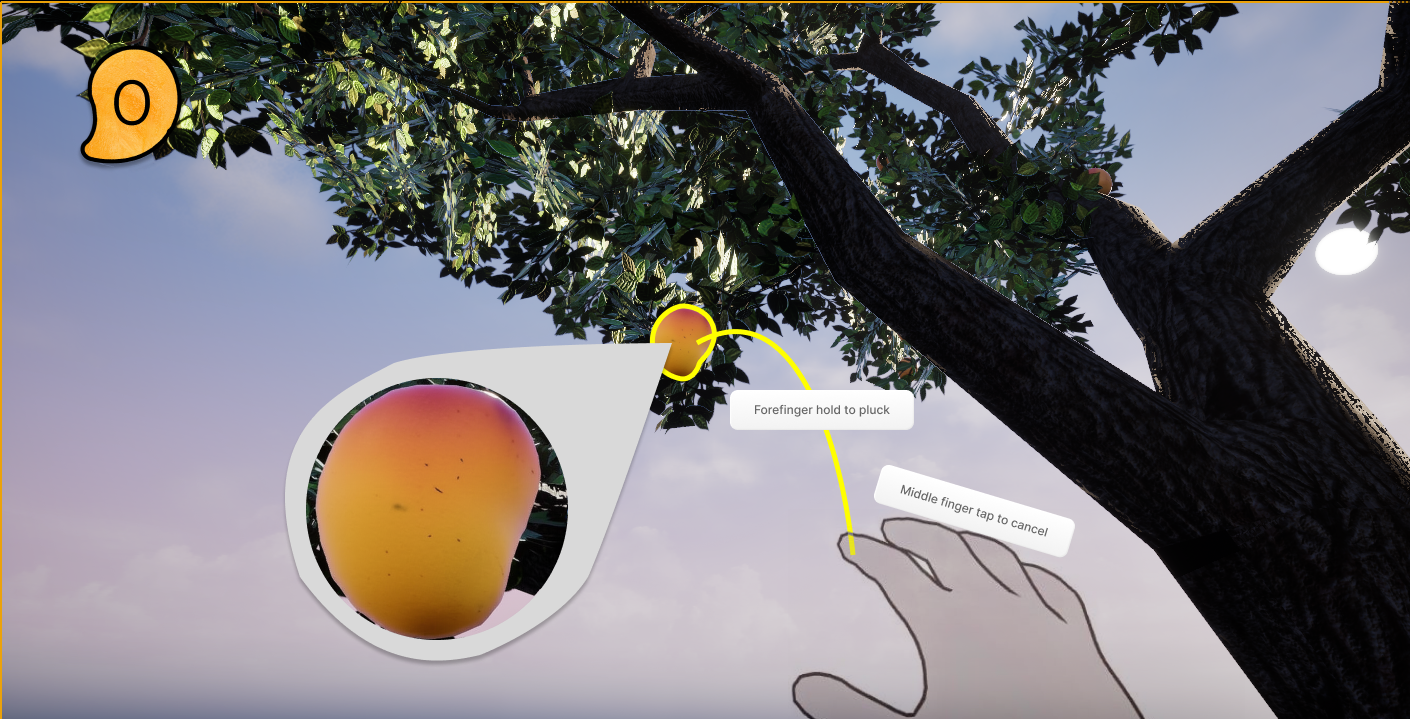
Hand tracking on Meta Quest 3. All gestures within a natural arm arc, no raised arms, no overhead reach.
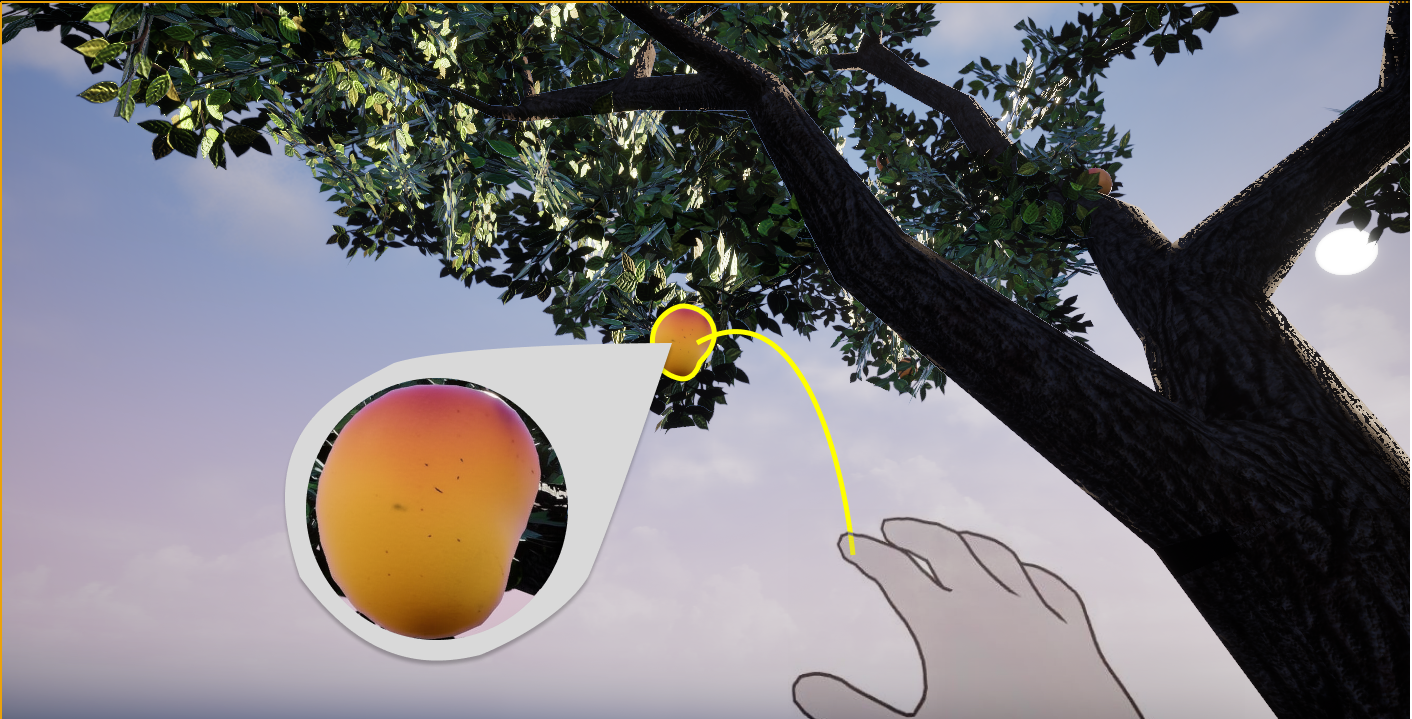
Select. Mirrors the physical click, the most universal learned action
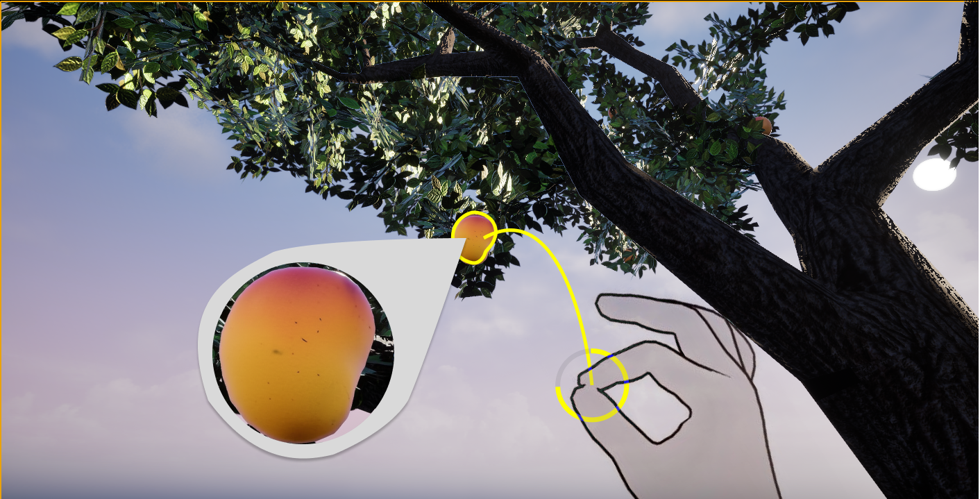
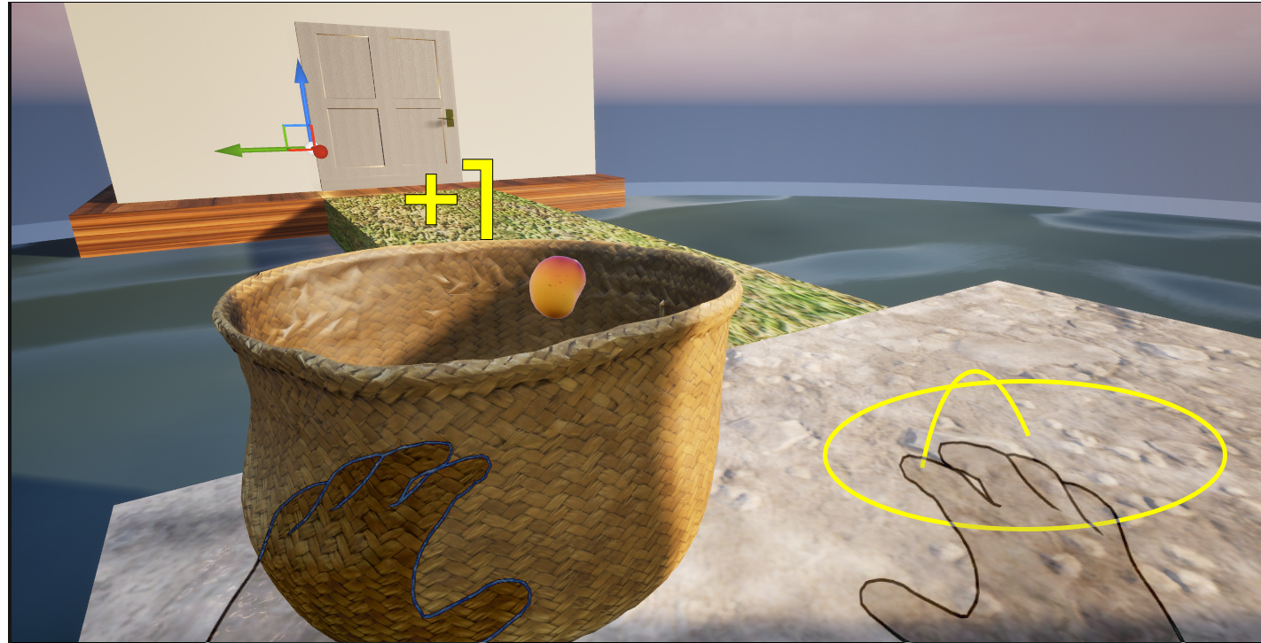
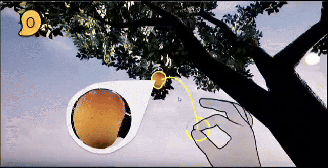
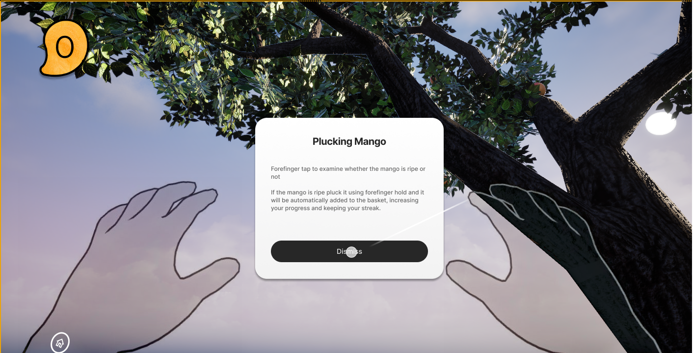
Pluck / harvest. Sustained grip signals sustained intention, prevents accidental harvest
Cancel / deselect. Fast one-handed escape without navigating a menu
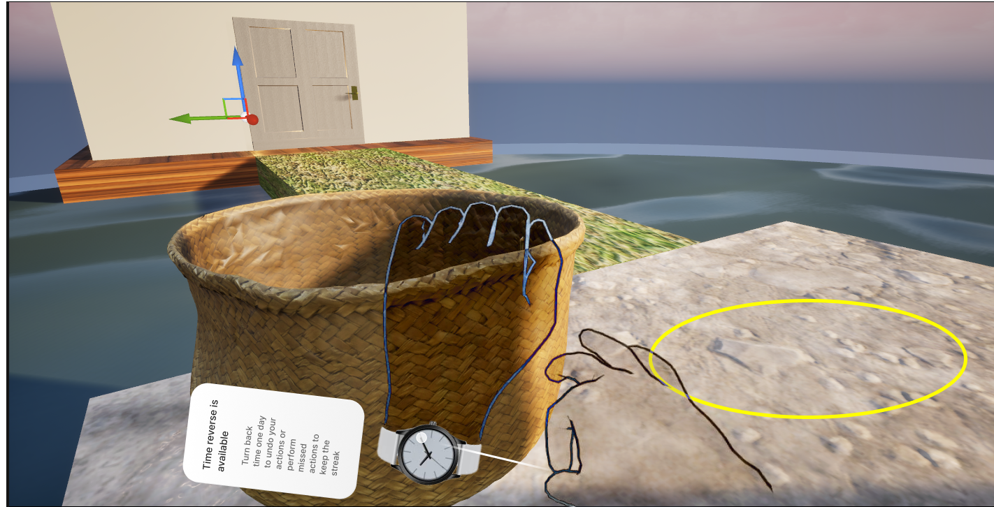
Reverse time / undo. Mime winding a watch dial and the world rewinds. Mangoes return to branches.
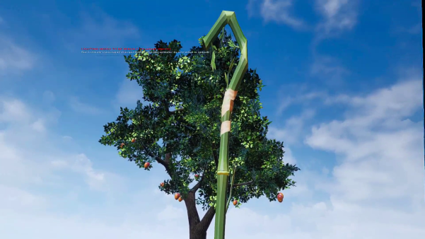
The pole mechanic, and why it failed.
The first iteration established the dome, island, and tree. The harvest mechanic used a physical pole, accurate to how mangoes are harvested in India (a long bamboo pole with a cloth bag at the end). Authentic on paper.
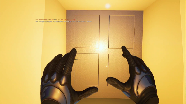

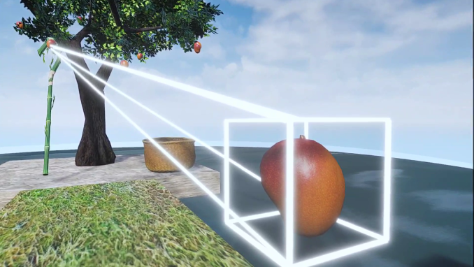
Screen-based Figma prototype using UE5 captures, a recognised method for surfacing spatial usability issues without a native VR build. Participants were given context and tasked with plucking a mango and returning to the Home Room. Real-world interactions do not transfer 1:1 to VR: the pole's weight, haptics, and spatial anchoring that make it intuitive in reality are absent in virtual space.
Pole mechanic was immediately confusing, did not behave as expected from the gesture or visual feedback.
No exit, undo, or home option anywhere. Users felt locked in.
Selection → zoom → cancel flow was broken and unrecoverable without assistance.
Several interactions were never discovered, completely invisible to a first-time user.
Spatial path from entry to tree added confusion rather than orientation.
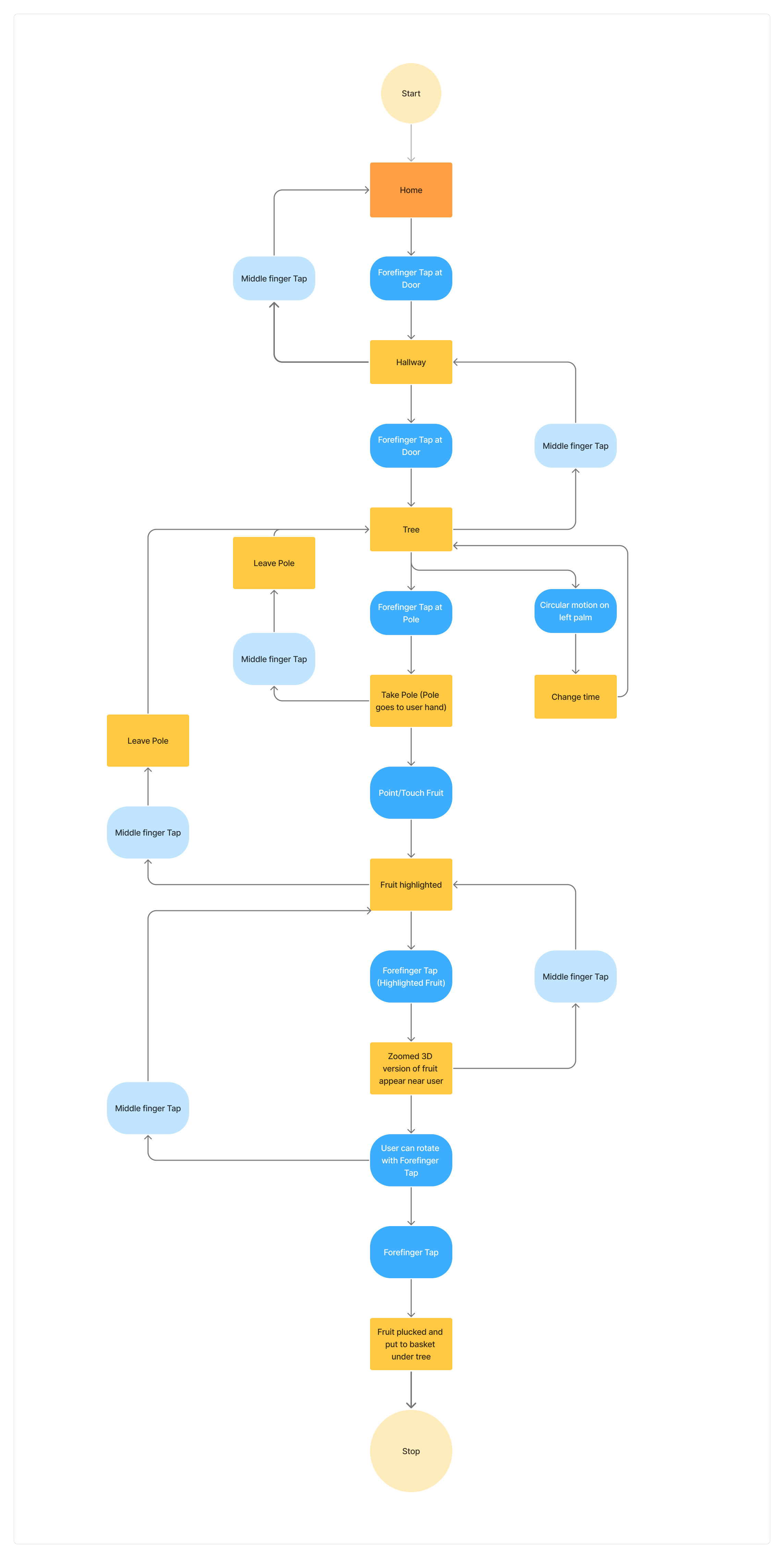
Rebuilt from the pilot findings up.
Pole mechanic removed. Interaction model rebuilt around direct forefinger hold.A Home Room added as a threshold space before the tree dome, designed to prime anticipation before the experience begins. Teleportation anchors path-ordered. Selection and cancel flow rebuilt with explicit visual state cues.
Figma prototype screens (23 screens), built from UE5 environment captures to simulate the spatial layout for usability testing:
Three evaluators. Six heuristics with findings.
Three evaluators tested the Iteration 2 prototype independently against Nielsen's 10 Usability Heuristics.
Every critical finding addressed.
Each Severity 3 and Severity 2 finding from the heuristic evaluation was directly resolved.
The streak counter was added to drive return engagement. The problem: it uses extrinsic motivation mechanics inside an experience designed for intrinsic calm. Self-Determination Theory identifies this as a structural conflict. Extrinsic rewards, particularly loss-aversion mechanics like streak counters, are known to undermine intrinsic motivation over time. In real life you return to a tree because the mango is ripening and you will eventually eat it. In VR the fruit cannot be eaten. Whether the process alone is enough to sustain return engagement, and what a non-gamified retention mechanic might look like, remains an open problem.
1. Visibility of System Status: Persistent HUD streak counter


2. Match Between System and Real World: Glide-to-basket animation
3. User Control and Freedom: Persistent home button


4. Consistency and Standards: Non-diegetic instructions throughout


5. Recognition Rather Than Recall: Plucking added to onboarding + contextual hints
6. Error Prevention: Ripeness indicator


The final prototype, in motion.
Full walkthrough of the Iteration 3 prototype: Home Room entry through mango selection, harvest, and wrist-rotation undo. This is the version participants used in the usability questionnaire.
Directional signal. N=3.
5-statement Likert scale administered after the final prototype. N=3, academic sprint context. Treat as directional signal, not statistical validation.
| Statement | Signal | What it means |
|---|---|---|
| I found this app calming and relaxing | Positive | 2 Agree, 1 Neutral. Core intent landed |
| I was able to understand and use features easily | Neutral | 3 Neutral. Aligns with heuristic finding on discoverability |
| The interface felt simple and uncluttered | Neutral | 3 Neutral. Onboarding clarity affecting perceived simplicity |
| Minimal design helped me stay focused | Strong | 1 Strongly Agree, 1 Agree, 1 Neutral. Kanso principle validated |
| Interactions felt easy to learn and intuitive | Strong | 1 Strongly Agree, 1 Agree, 1 Neutral. Gesture model working |
Neutral ratings on ease-of-use and simplicity align directly with the heuristic findings. Discoverability and onboarding completeness are the gap, not the core interaction model.
Where this goes next.
Aam points toward a future where technology reconnects urban people to seasonal, embodied experiences they have lost access to.
Seasonal cycles
Trees that fruit and thin with the real-world calendar. Miss the season and you wait. Soft-decay streak tied to absence.
Audio & haptics pass
Leaf rustle, the specific sound of a stem snap, wrist buzz on successful pluck. A dedicated soundscape usability study for calmness without distraction.
Moveable basket
Users reposition the basket before plucking, restoring the real-world skill and intention of placement, the part the pole mechanic was trying to capture.
Tree care mechanics
Watering, monitoring, waiting. Expanding the emotional investment loop beyond a single harvesting session into something you return to.
Reflection
The course framing (Usability Engineering) pulled this project toward interaction mechanics and evaluation rigour. That was the right constraint. The gesture model tested well. The iterative redesign addressed every critical finding. As a usability study, it worked.
What it could not test was the thing it was actually trying to do: whether the ritual itself translates. The daily return, the slow accumulation of anticipation, the feeling of a harvest that was waited for. Those qualities require time and repetition that a three-week sprint with three participants cannot measure.
The deeper question ↓
More from


